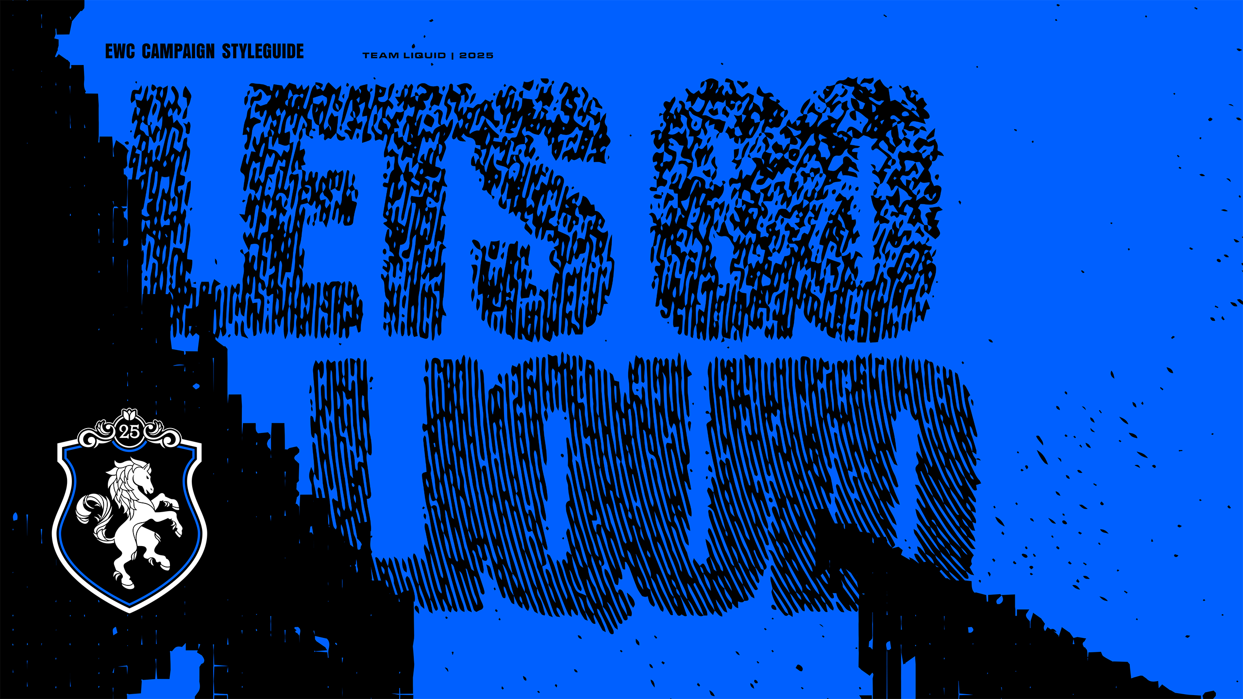
EWC is one of the largest events in all of Esports, with a ton of titles clustering their international championships into one large event with a club competition component. The scale and variety of a tournament like this creates really unique challenges for external communication as an esports team.
EWC is a massive undertaking with the event spanning practically every roster of the organization. The creative process of developing an approach that is scalable to fit not only the scale of the event but also match the level of stakes is a huge challenge
I was responsible for translating the creative vision of Tiago Paixao, who creatively directed the project to a scalable approach that our entire team would be able to execute on.
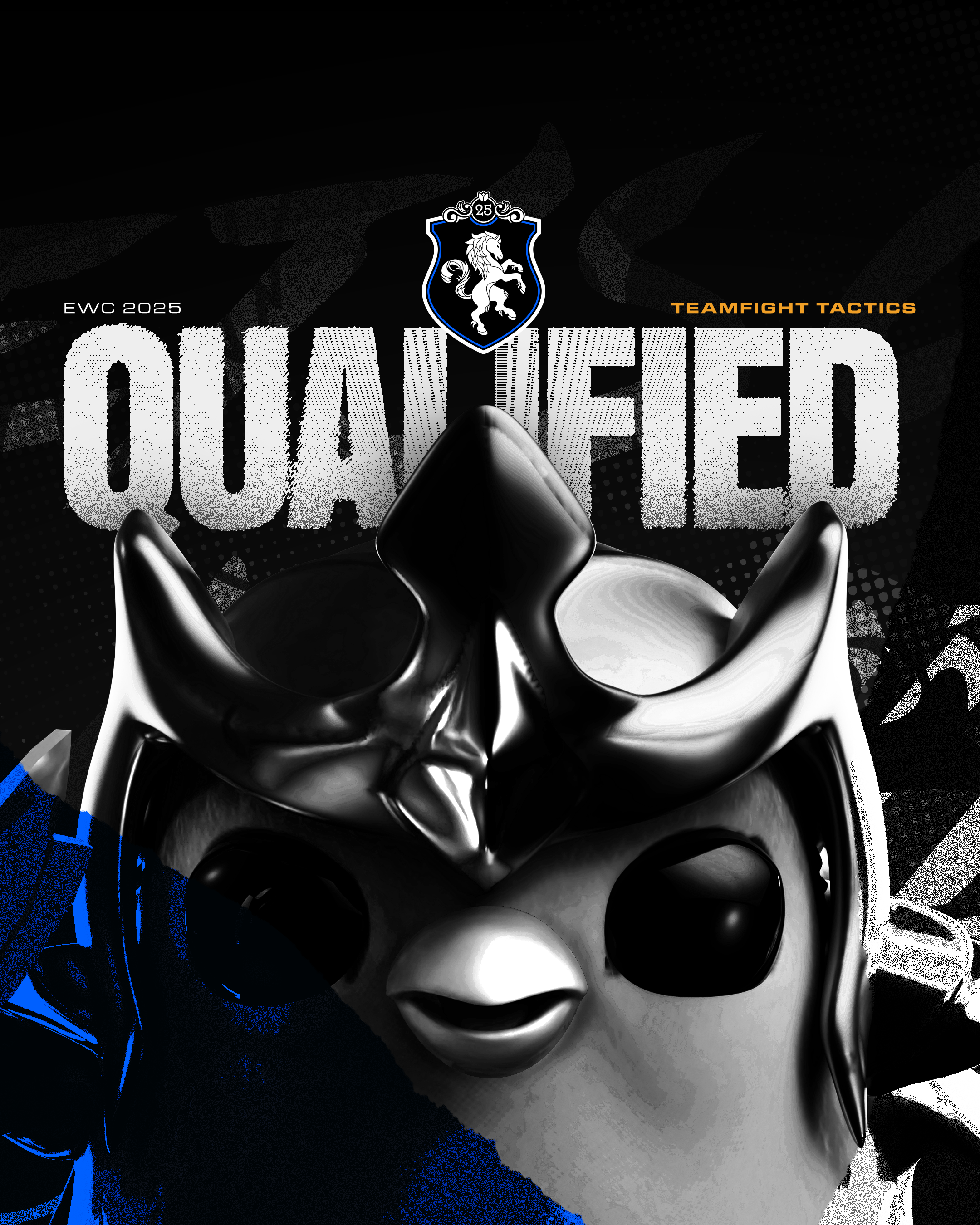
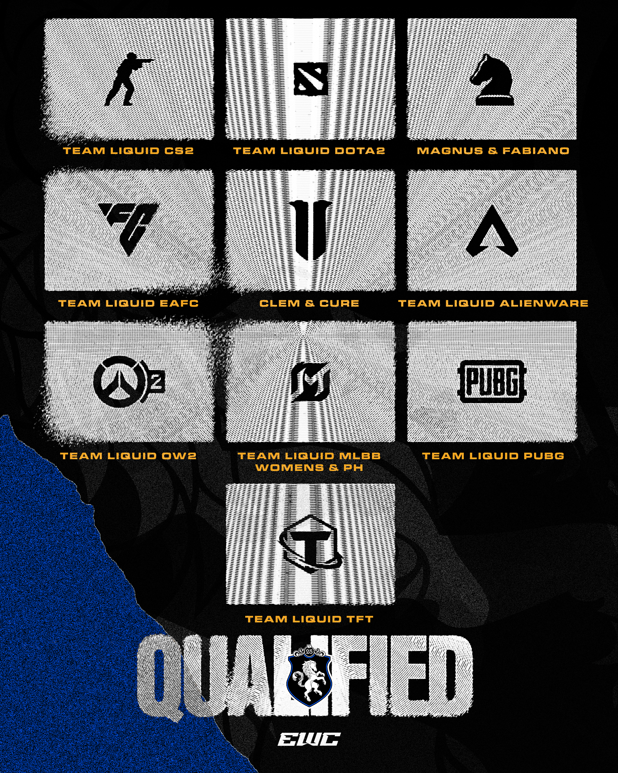
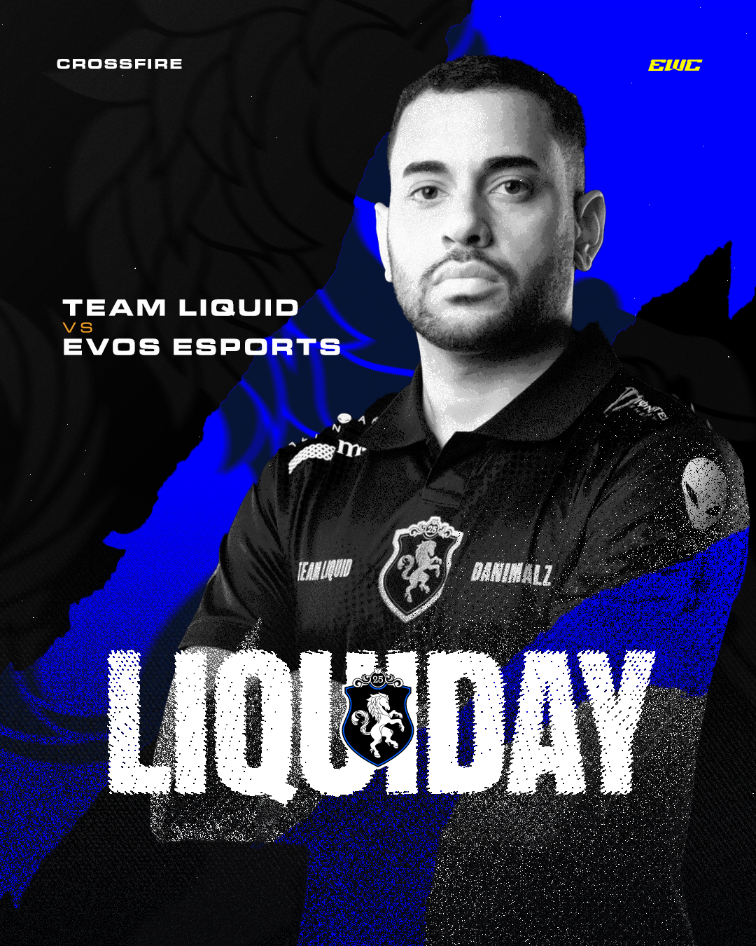
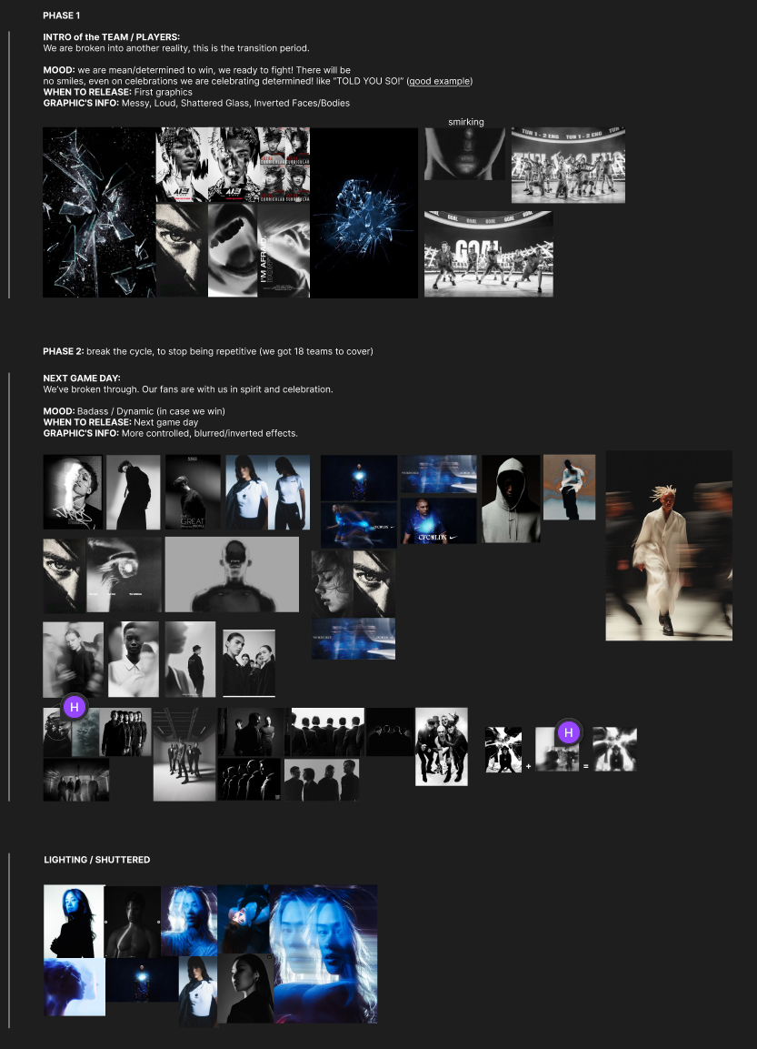
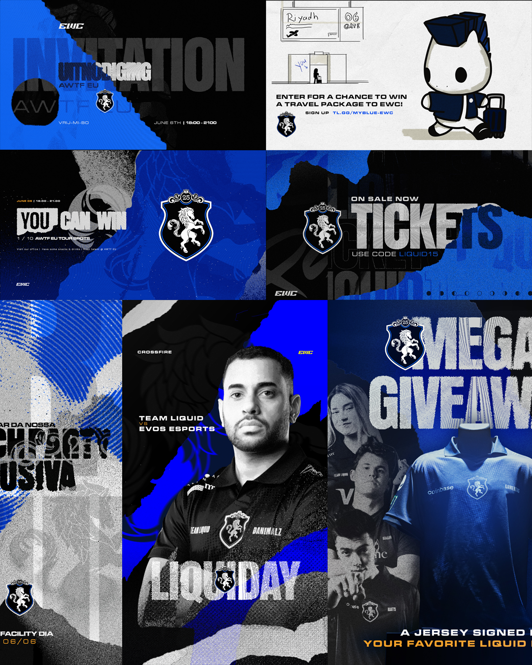
The general approach for these graphics was a heavily stylized approach, the provided assets we were able to leverage weren't very uniform and thus to guarantee a uniform output we had to pretty severely manipulate the imagery.
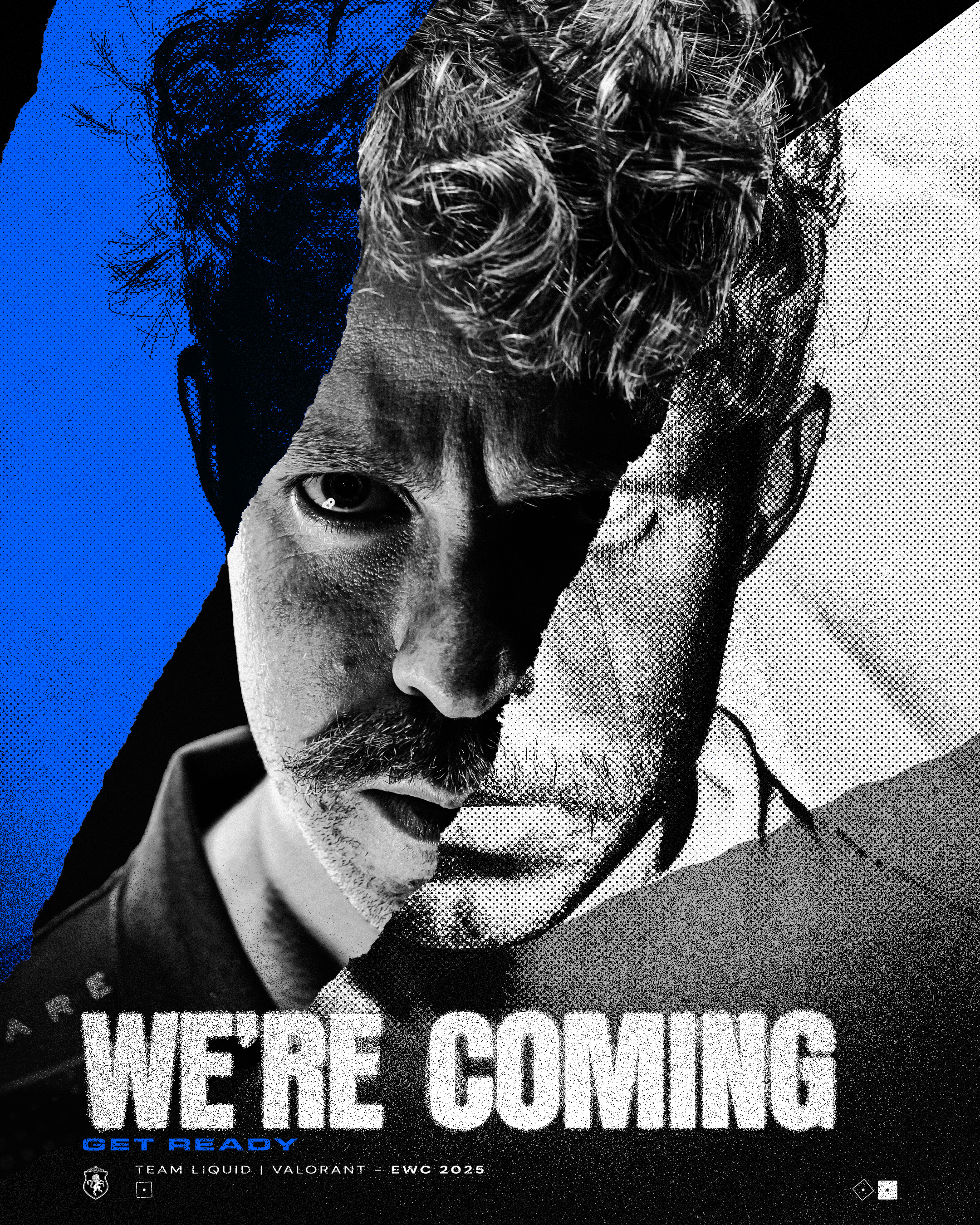
Our choice for a high contrast blue & black palette was a refreshing approach for Team Liquid, black was not a very common color for us to leverage, which added a sense of weight that really felt fitting because of the "weight" of the competition they were competing in.
The overall direction was split into 2 phases, one for everything leading up to the moment of competition and one for during & after the moment of competition, meaning that we had to develop 2 distinct but fitting approaches.
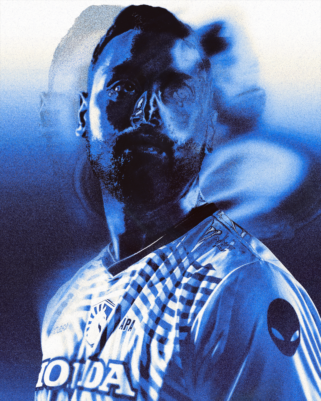
Phase 1 relied heavily on paper tears, texturing & halftone effects with black and white photography whereas phase 2 worked a lot with shaped film burn effects that affected the exposure of certain areas of the photography.
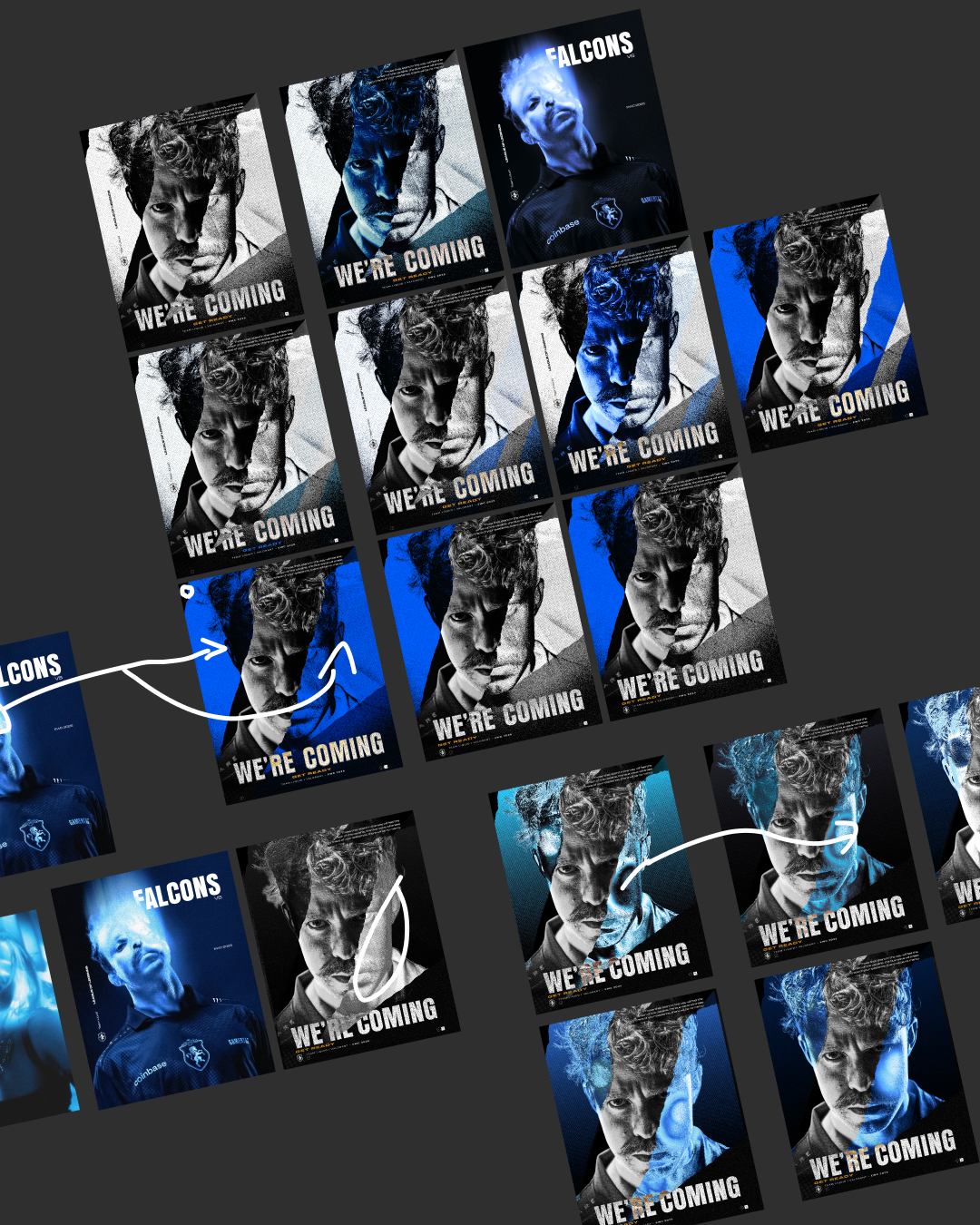
Although the vision was pretty clear there are a lot of technical limitations to how to approach a project of this scale, during the exploration I was finding different ways to approach the same vision and streamlining the process to achieve these results.
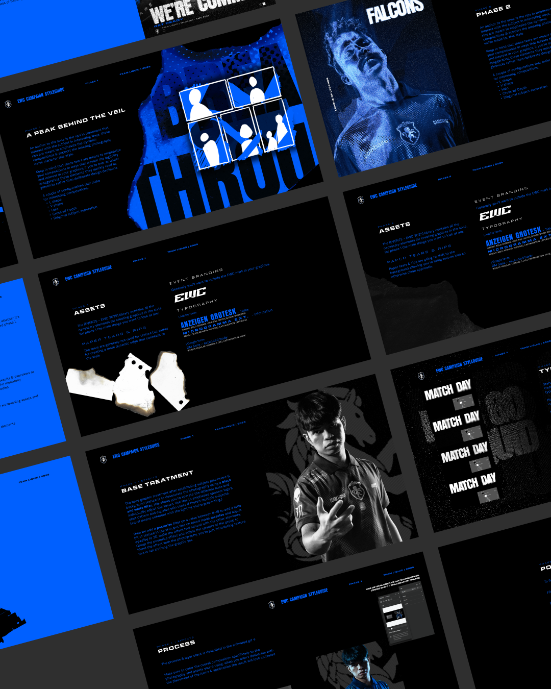
The result of the exploration phase was a detailed guide outlining the specific effect stack that was used, typography, composition & copy guidelines. This enabled the team to independently develop graphics without needing to spend as much time on quality control or assistance.
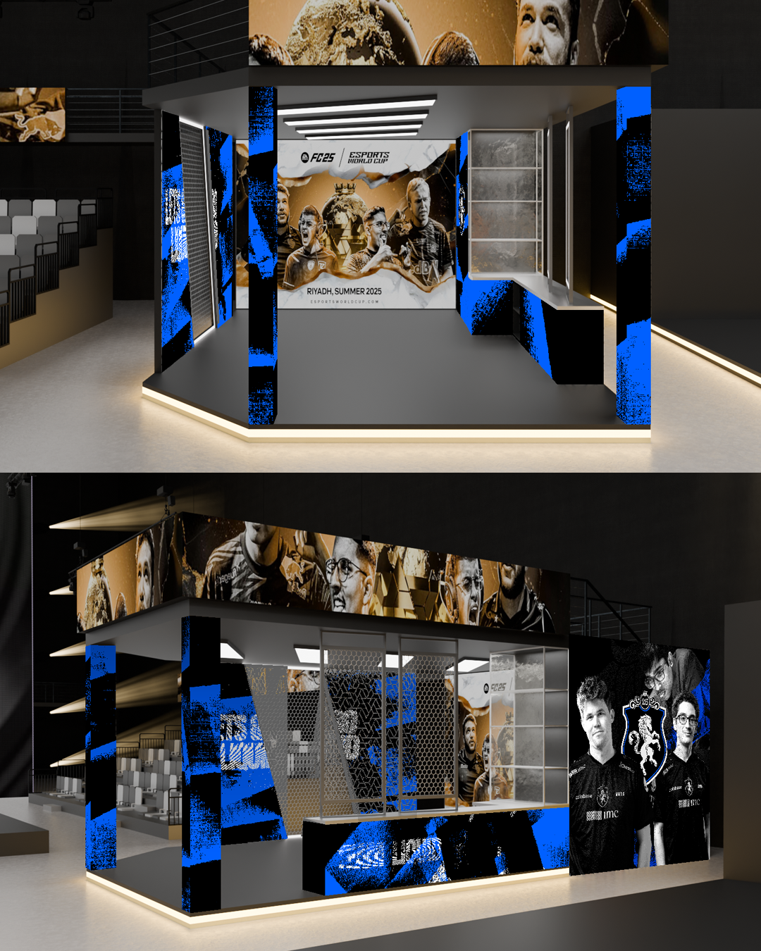
The overall campaign concluded with Team Liquid securing second place in the club championship, with every team receiving coverage throughout the event that didn't compromise on quality in order to scale with the tournament.
over 100 graphics were produced and published, these graphics reached massive audiences in each respective title, all produced in-house while the tournament was ongoing.
No testimonials available.